Our Mission
Lorem ipsum dolor sit amet, consectetur adipiscing elit, sed do eiusmod tempor incididunt ut labore et dolore magna aliqua. Ut enim ad minim veniam, quis nostrud exercitation ullamco laboris nisi ut aliquip ex ea commodo consequat. Duis aute irure dolor in reprehenderit in voluptate velit esse cillum dolore eu fugiat nulla pariatur. Excepteur sint occaecat cupidatat non proident, sunt in culpa qui officia deserunt mollit anim id est laborum.
Sed ut perspiciatis unde omnis iste natus error sit voluptatem accusantium doloremque laudantium, totam rem aperiam, eaque ipsa quae ab illo inventore veritatis et quasi architecto beatae vitae dicta sunt explicabo. Nemo enim ipsam voluptatem quia voluptas sit aspernatur aut odit aut fugit, sed quia consequuntur magni dolores eos qui ratione voluptatem sequi nesciunt. Neque porro quisquam est, qui dolorem ipsum quia dolor sit amet, consectetur, adipisci velit, sed quia non numquam eius modi tempora incidunt ut labore et dolore magnam aliquam.
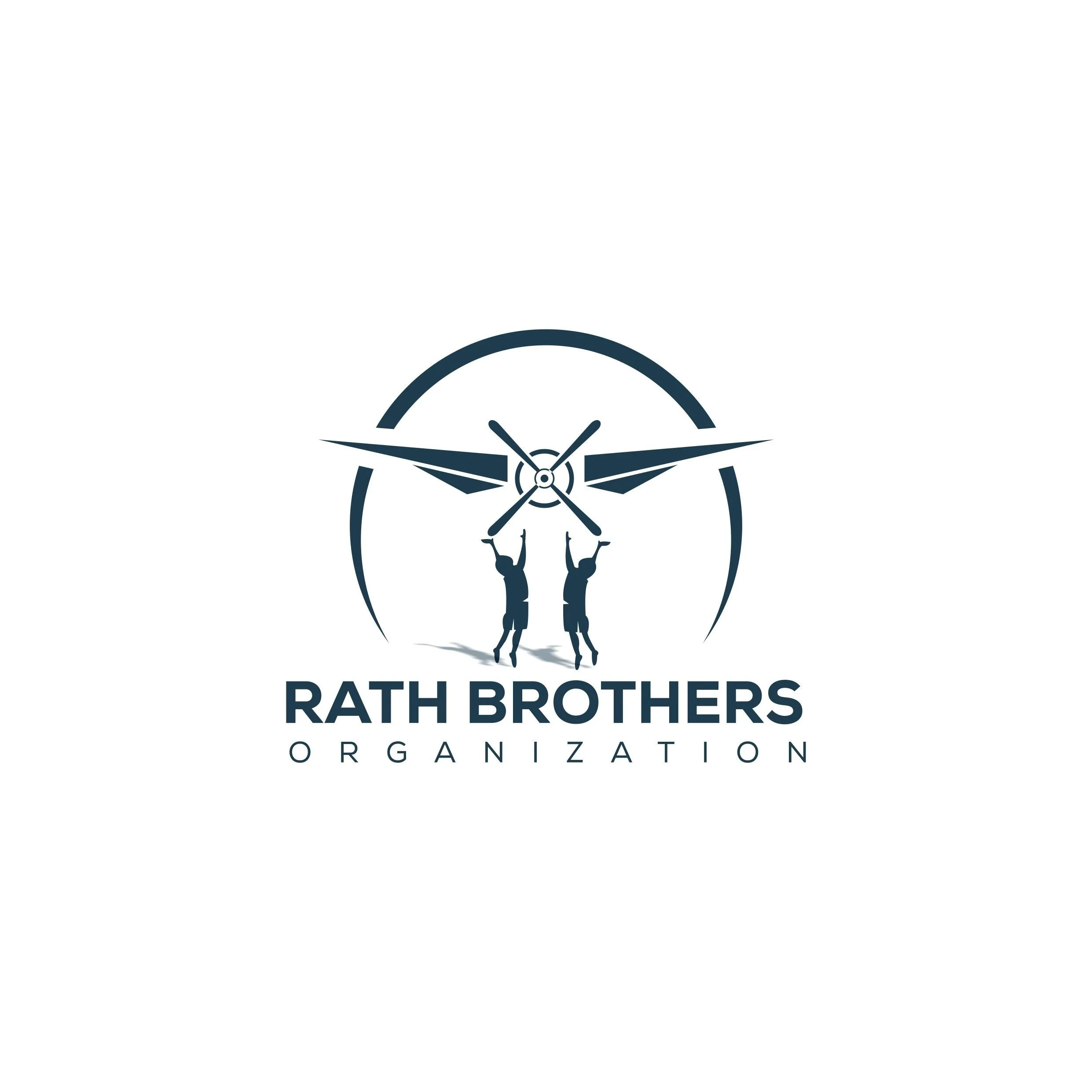
The story behind our logo:
At 16 weeks Waylon and Lucas were diagnosed with twin to twin transfusion syndrome (TTTS). 36 hours later David and I were in Kansas City where the three of us had surgery to correct it. We found a coffee shop called The Roasterie that was inside the children's hospital. We later found their headquarters location downtown with a 1930’s era DC-3 propeller plane on top of the building as well as the primary focus of their branding. Because of multiple complications back to back, we spent a lot of time in KC throughout the pregnancy and even ended up moving the whole family and renting out a house for a month. I had appointments at the children’s hospital every other day during that month. With every appointment we received good news about the boys health, we would stop at The Roasterie and call it a “victory lap” in celebration of one more good appointment down. We even ended up having a Roasterie themed baby shower and Roasterie themed baby nursery. It was a sign of comfort and good news during a hard time and kind of a symbol of security. That said, we felt it would be appropriate to tie that connection into the branding process for The Rath Brothers Organization.